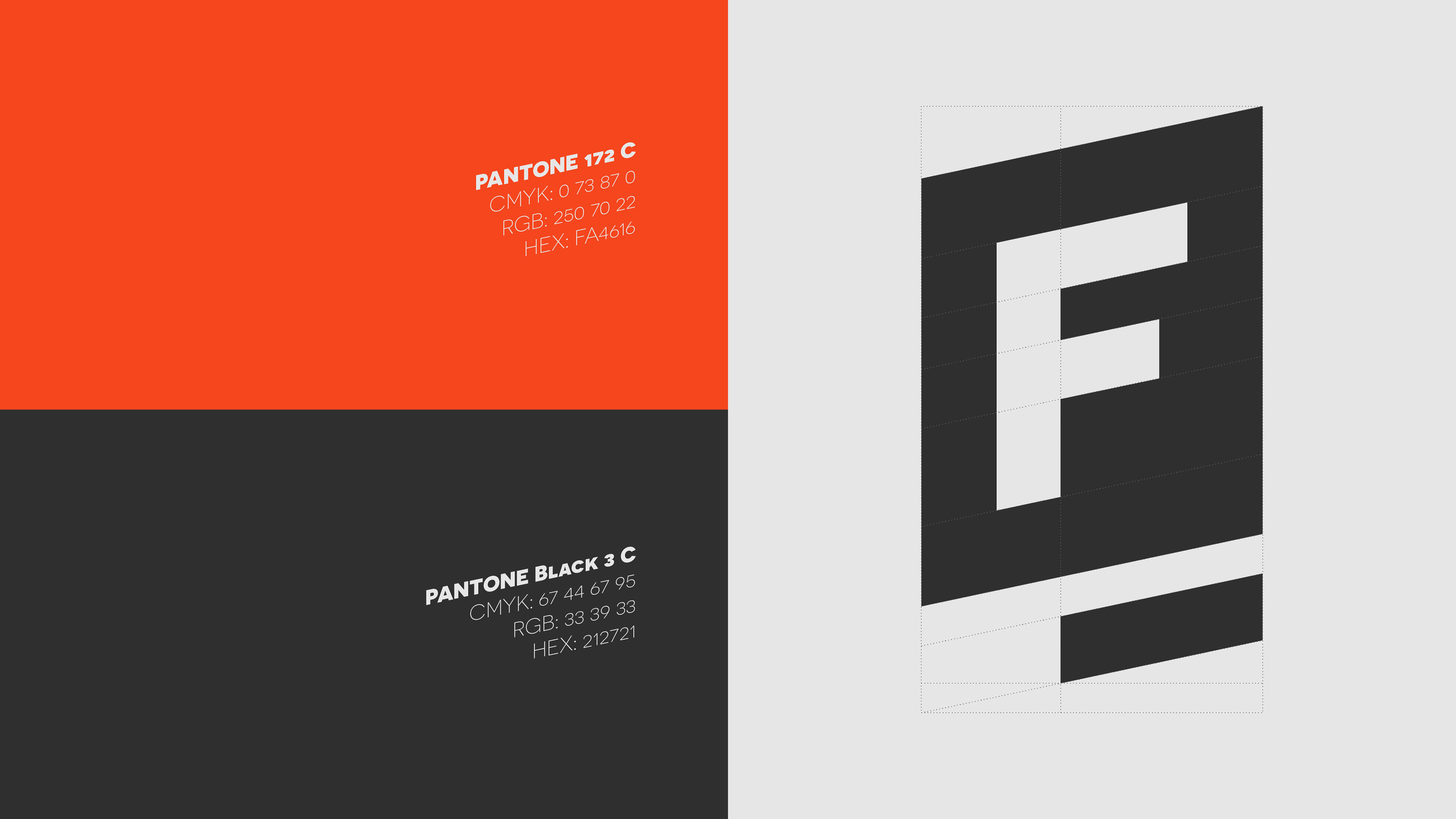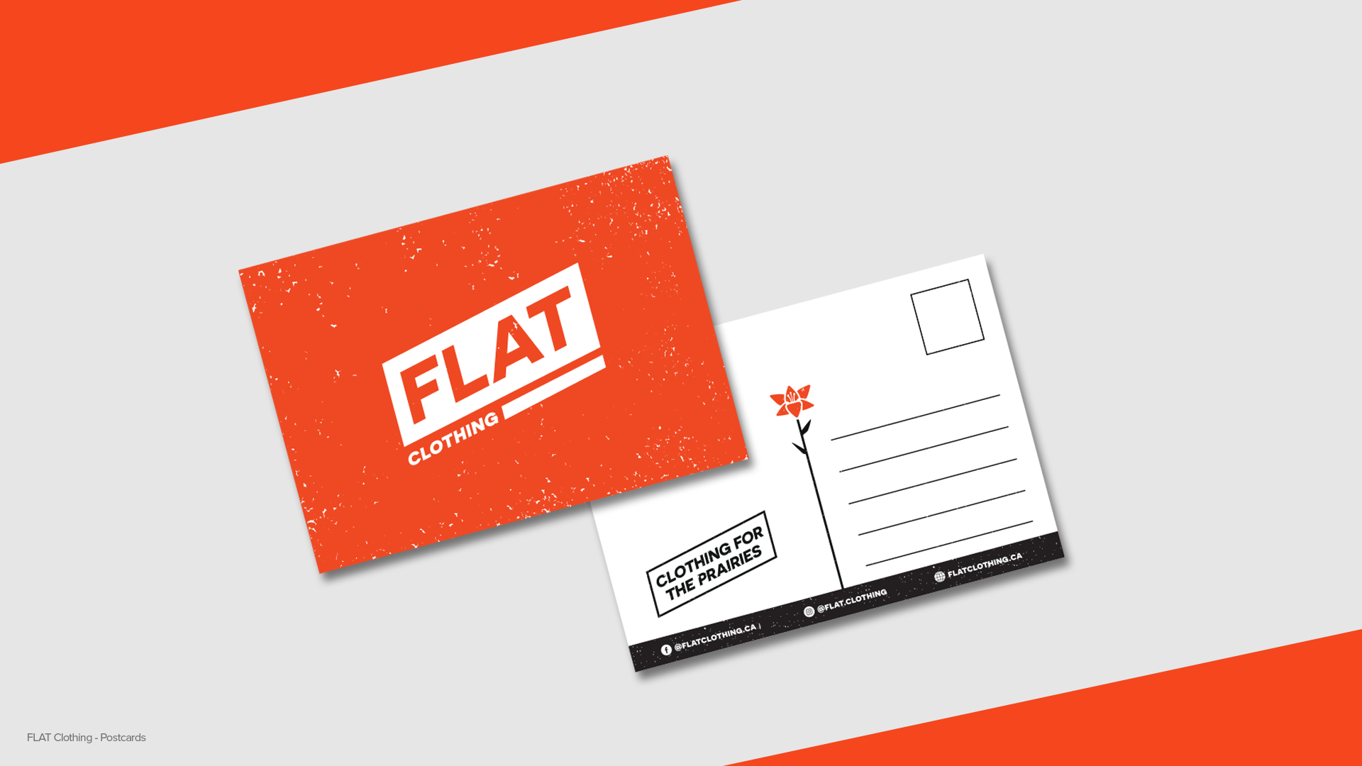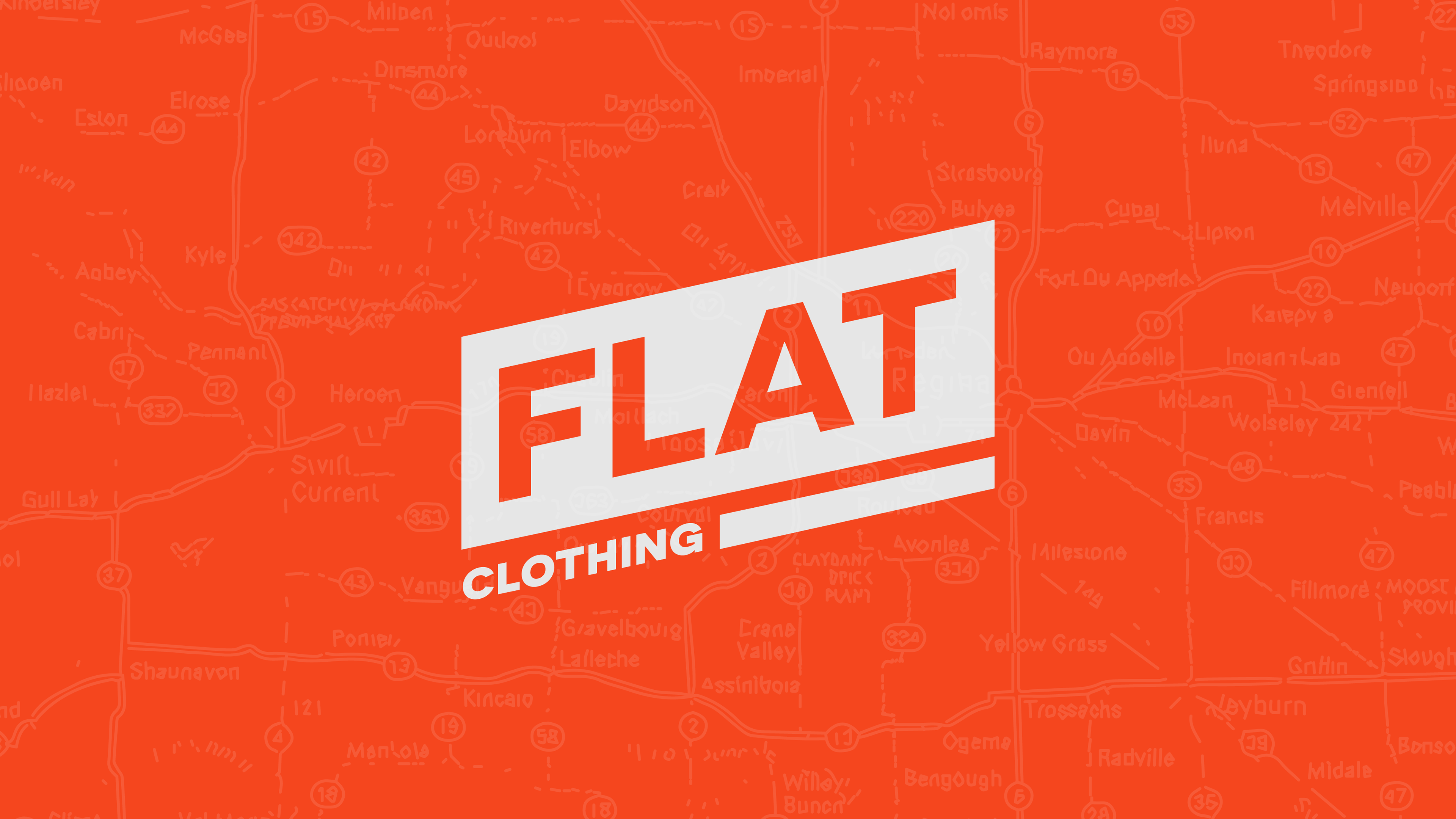
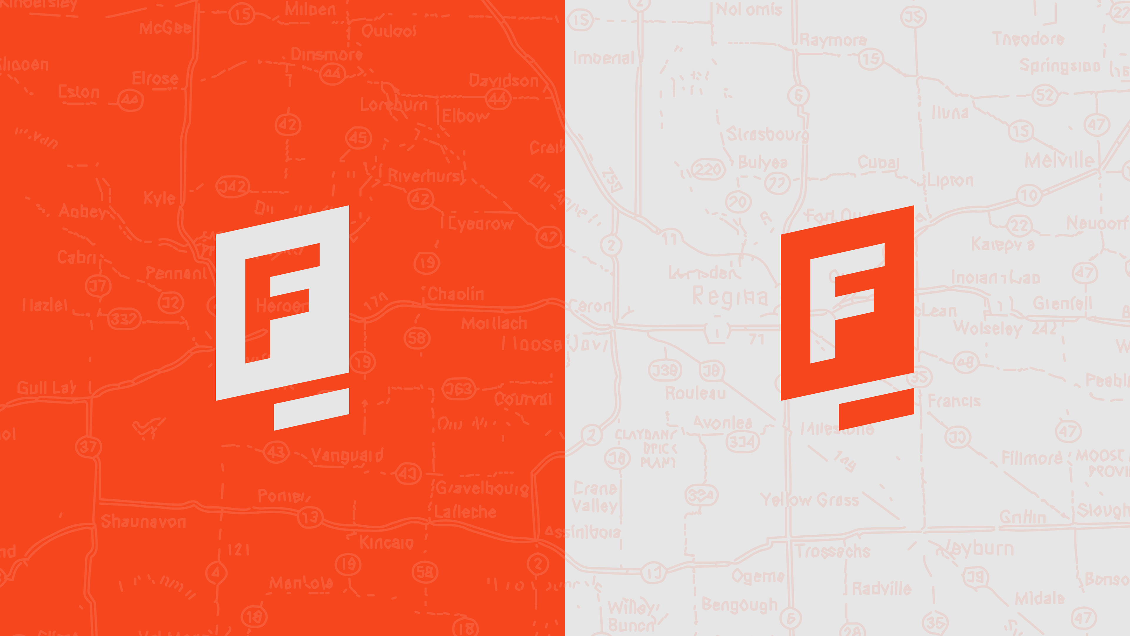
The Brief
The challenge of this project was taking an existing, trusted brand, and updating the visuals without straying from the pillars that made it great in the first place. The old logo prominently featured a “Saskatchewan shape” which the client wanted to move away from, but keep the prairie feel.
The Audience
Customers of all ages looking for a rustic, prairie-based brand.

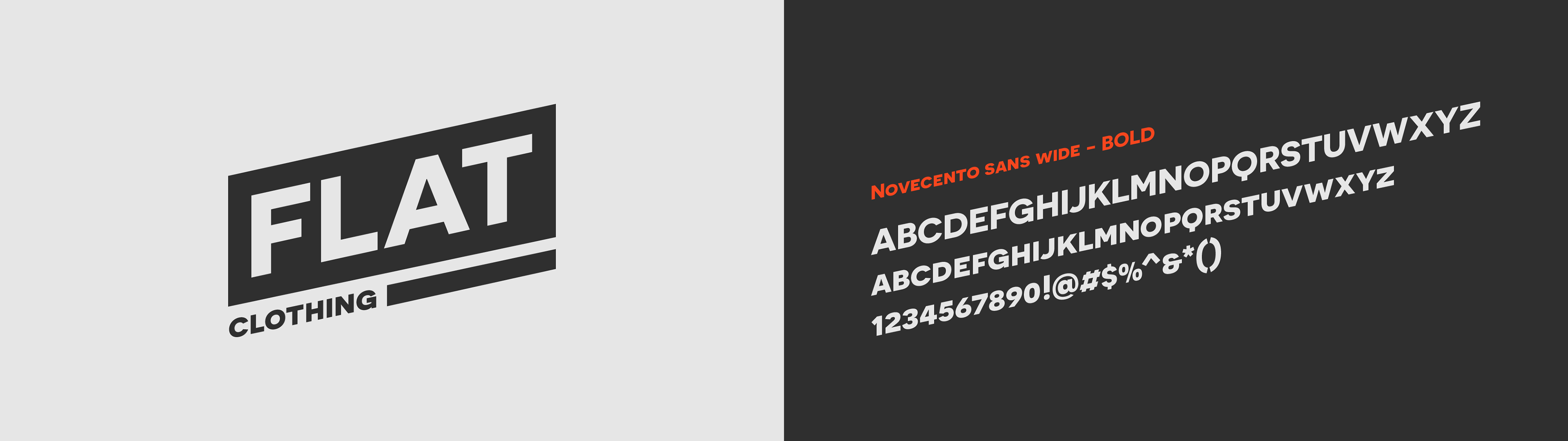
The Solution
I knew from the outset that we would need to replace one basic form with another one. The old logo featured the Saskatchewan shape and type, so I took those same ideas but refined it and injected the graphic with some energy and upward momentum (literally, in this case). After that a truncated version was created highlighting the “F” in a faux-exclamation-point.
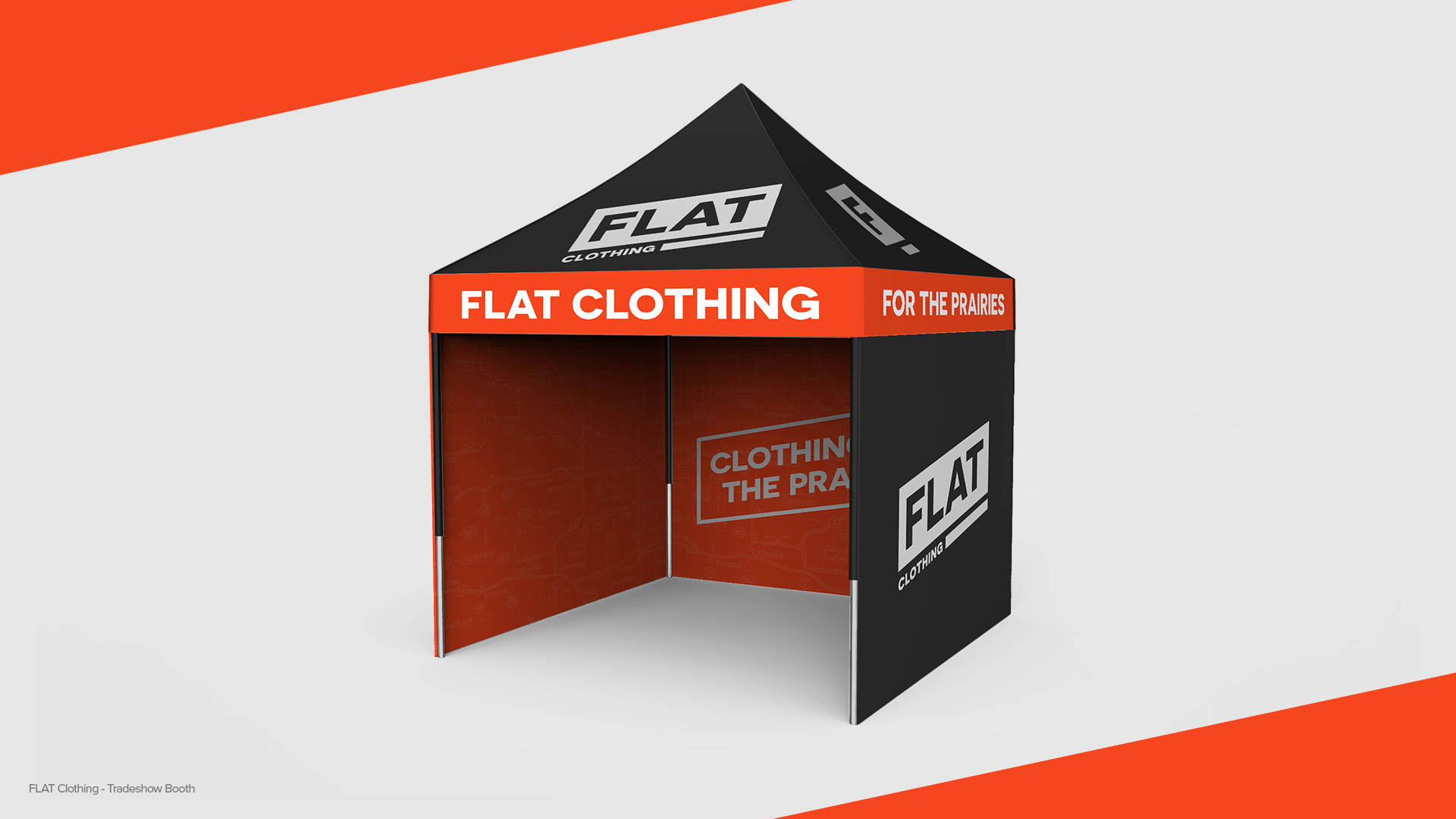
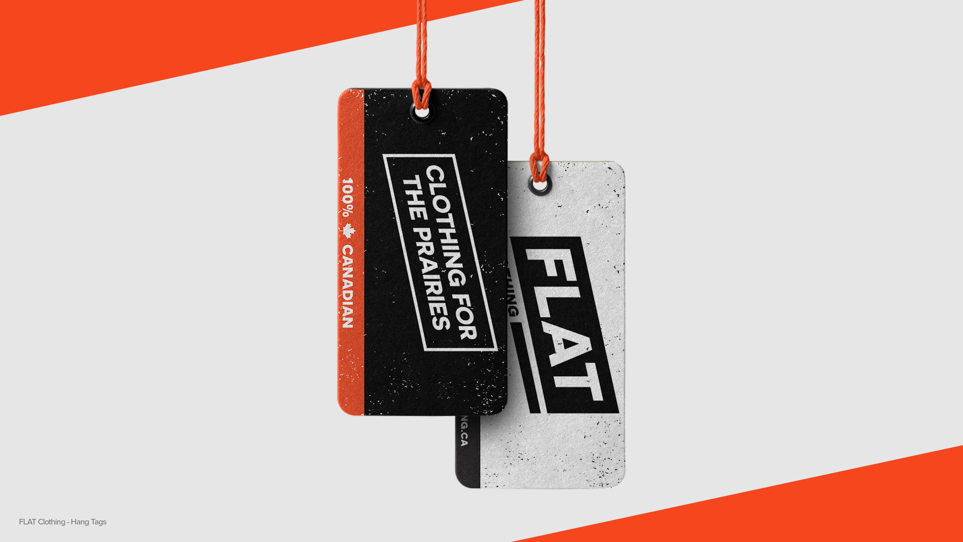
To keep the prairie roots, we added a rough Saskatchewan map that can be used as a background supporting element to really drive the point back home when needed.